May 5, 2010

Map of the Week #9 (the final)


Well, here we go. The last map of the week on here. The first map that you see on this post refers to the world map with countries marked by GDP per capita. I found no data for the Chinese economy in 1990, thus the gray you see in its place. The map also shows a distinction between the First World, the Second World, and the Third World, particularly by the close of the Cold War.

The second map seen is about the small African nation of Burundi. This uses the Mercator projection and plots the population distribution throughout (using dot density). They tend to be clustered around the areas in the north, even when there are rivers and agricultural lands throughout the country (not necessarily commercial, as most Burundians live off subsistence).

Both of these maps were adjusted since the presentation. I really hope that you all enjoy a good summer! Oh, and since today is Cinco de Mayo, I thought I would offer a map of Mexico, relating to potential wind power. A darker shaded region has higher potential for wind power.

Apr 28, 2010

Map(s) of the Week #8


This map is representative to the Hispanic population of Idaho. The purple area of the map is very likely to be the sparsely-settled regions in Idaho, especially the mountainous regions. The part of the map which gave me the most problems is the key itself (thus you could see a thick border on the first category there). As could be seen here, Hispanics are more widespread and densely distributed in the south, particularly in and near Boise (but Canyon County has more than Ada County does). The maps shows where they are in relation to the local geography.


This is a global map of the Earth with world capitals with at least 750,000 people labeled. Sorting out the data for that is sort of time-consuming, but not hard, considering that sorting a category in descending order can help. The legend of the cities is stacked with the lowest population in front, and the legend therefore goes in descending order, from highest population down.


This is the map of vacant homes in Buffalo, New York. The symbol of a house represents a certain, approximate, number of vacant houses in the area, which can most commonly be seen in the center. The legend is sorted in descending order from the highest number down.

And as a bonus...

I have here another non-project map to present as a weekly map. I've been doing maps based on current events/the world for quite a while that I decided to change gears for a moment. This week's map is 2Fort (capture the flag) from the popular multiplayer shooter Team Fortress 2. This takes into account the frequency of a player "death" throughout the map, going from blue (least frequent) to green to yellow then to red (most deaths). Based on the coloring, the most deaths occurred on and near the bridge linking the two sides

Apr 21, 2010

Map of the Week #7


Usually out on October 20th of each year, the Press Freedom Index by Reporters Sans Frontières sorts each county by press freedom. In the 2009 report, the United States is currently ranked 20th in the world (tied with Luxembourg and the United Kingdom), with a best score since the 2004 report. The representations on the map has a color scheme that transitions from green to yellow, then yellow to red, going from the greatest press freedom to the least. The interactive map can be accessed here.

Apr 14, 2010

Map of the Week #6 (and a couple more)


Just recently, an earthquake measuring 6.9 on the Richter scale hit a remote county in the Qinghai province of China, and officials say that nearly six hundred people died, with thousands being injured. This occurred about two years after a similar earthquake that occurred in the neighboring province of Sichuan. The map attached (from the BBC) gives the location of the quake as well as two inlet maps: one of Qinghai province's location in China and within it, its location in the world.

And just recently, I created a couple of maps using two interpolation methods: Inverse Distance Weighting and Kriging. Both of them are about the annual precipitation patterns in Idaho.

Inverse Distance Weighting

This is a fairly complex map and brings into detail the contour lines in Idaho. In fact, there are small, isolated contour pockets surrounding certain weather stations


Kriging

The map simply puts that in Idaho, it typically rains more in the north than it does in the south. While it is easy to understand, there are still some discontinues present, and the contour lines are drawn mostly based upon the geographical surroundings.

Apr 7, 2010

Map of the Week #5

Just recently, there has been political unrest in Kyrgyzstan. Protesting the recent price rises as well as government corruption, thousands of demonstrators took to the streets. The riot police were deployed, using stun batons, tear gas, and (at last resort) live ammunition at the protesters, and then the protests turned violent, turning into a clash against the police. On both sides, at least 40 people died and many more were wounded from the conflict. Just today, Prime Minister Daniyar Usenov resigned, but the current whereabouts and status of President Kurmanbek Bakiyev is currently unclear. Protesters wanted the president to step down, accusing him of being increasingly autocratic and unable to fix the economy.

This map below is a satellite image over the capital Bishkek, identifying the location of the government house there. There is also an inlet map, with a map of Kyrgyzstan itself, with protest-hit cities marked. For those who don't know, it is in Central Asia and bordered by Kazakhstan to the north, Tajikistan to the south, Turkmenistan to the west and China to the east.

Mar 31, 2010

Map(s) of the Week #4

OK, so today is the due-date of one of my class projects, and here it is:

Qualitative Map


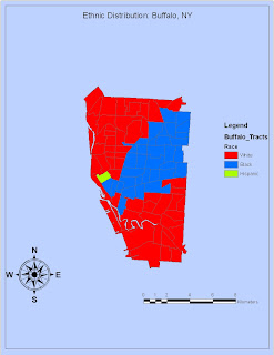
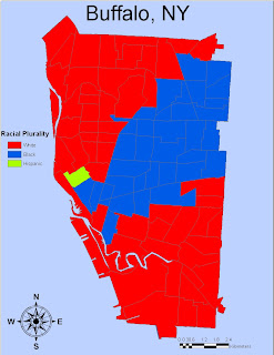
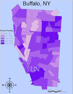
The very first map I’ve experimented with for the lab activities is the qualitative map of Buffalo, New York, analyzing the racial distribution by neighborhood. As could be seen here, there is far too much empty space on the first map, the title is too small, and there are visible flaws in the legend. For the revised map, the extent of Buffalo has been extended to cover the entire map. The north arrow and scale bar is placed better, and the legend simply has just a title and the color-coded categories as legends should (the word “legend” should be removed.)

Quantitative Map


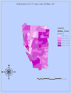
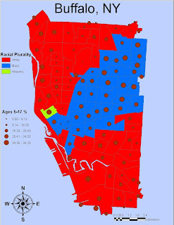
The quantitative map, which looks at the distribution of children ages 5 to 17, suffers from the same problems pointed out in the qualitative map. The visible difference in color when looking at the two maps is not a major difference, and pretty much the same methods used for the qualitative map was used. Furthermore, I have compiled a map taking into account BOTH qualitative and quantitative data, seen below.


Nez Perce Map


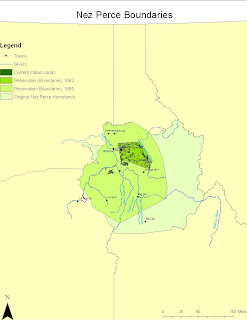
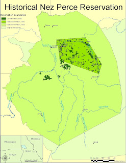
The major problems with this first map included that the map is far too huge, and the towns on the map are barely visible. It also lacked the inlet map that was assigned for this, so I made sure to include it for this map. Please note there are two scale bars, because they both give different representations, one for the inlet and the other for the main map itself. I strategically placed that inlet where there would be less conflict with the map features. I also saw no need to include towns and rivers into the legend of the second map, because they are widely understood anyway and the map is about the historical Nez Perce homelands. There is still one visible flaw though, and the names of towns would still sometimes conflict with boundaries and/or features on the map.

Freehand


Deep Green: National Park
Light Green: Forest/Park
Red: Cities and Towns
Blue: Rivers/Creeks
Thick Line: Interstate Highway (added for map 2)
Bold Line: Primary Roads
Thin Line: Secondary Roads
Dashed Line: Tertiary Roads

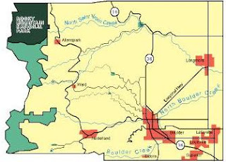
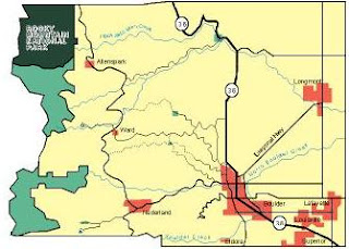
The map I drew for Boulder County, Colorado was fine, save for a few features. In the first map, the size of the font for the creeks are insanely huge, so I made sure to shrink it down to a reasonable, yet still presentable, size. I also added a thick line for the interstate highway passing through the city of boulder, because even with the numbering on, it still could be confused as just another primary road, or vice versa. Other than those, and the placement of the label ‘Longmont’, the map hardly needed revision.

Comparison of Map Types


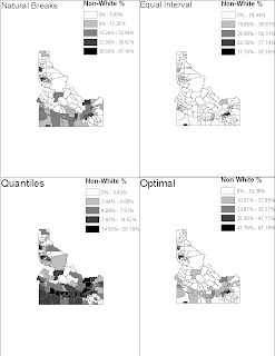
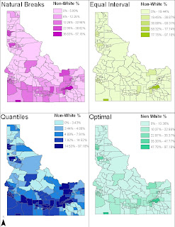
One obvious problem with the first set of maps is that there is far too much in each of those maps. As a solution to this problem, each of the maps are brought to the full extent for the second set, also ensuring greater visibility of the divisions here in Idaho. I also added color to the maps, because although the black-white color scheme is general, it might also be somewhat sensitive, given the subject matter of the percentage of all Idahoans non-white. The data used from those maps are used from the 2000 Census.

Mar 24, 2010

Map of the Week #3

In Israel, the issue of settlements in the West Bank is a contentious one. Just recently, despite calls to freeze settlement, the Israeli government announced that plans to build in occupied East Jerusalem shall go ahead. Such a move angered the Palestinians, who withdrew from US-brokered peace talks. This map of the week includes areas that are largely affected by barrier placements and Israeli occupation.