Qualitative Map
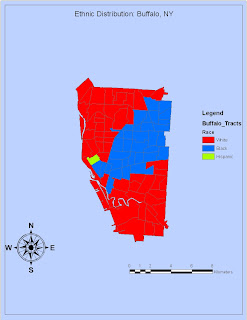
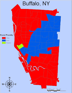
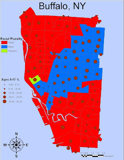
The very first map I’ve experimented with for the lab activities is the qualitative map of Buffalo, New York, analyzing the racial distribution by neighborhood. As could be seen here, there is far too much empty space on the first map, the title is too small, and there are visible flaws in the legend. For the revised map, the extent of Buffalo has been extended to cover the entire map. The north arrow and scale bar is placed better, and the legend simply has just a title and the color-coded categories as legends should (the word “legend” should be removed.)
Quantitative Map
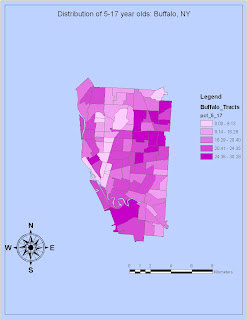
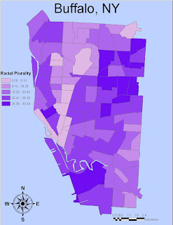
The quantitative map, which looks at the distribution of children ages 5 to 17, suffers from the same problems pointed out in the qualitative map. The visible difference in color when looking at the two maps is not a major difference, and pretty much the same methods used for the qualitative map was used. Furthermore, I have compiled a map taking into account BOTH qualitative and quantitative data, seen below.
Nez Perce Map
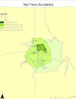
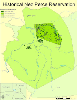
The major problems with this first map included that the map is far too huge, and the towns on the map are barely visible. It also lacked the inlet map that was assigned for this, so I made sure to include it for this map. Please note there are two scale bars, because they both give different representations, one for the inlet and the other for the main map itself. I strategically placed that inlet where there would be less conflict with the map features. I also saw no need to include towns and rivers into the legend of the second map, because they are widely understood anyway and the map is about the historical Nez Perce homelands. There is still one visible flaw though, and the names of towns would still sometimes conflict with boundaries and/or features on the map.
Freehand
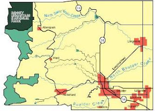
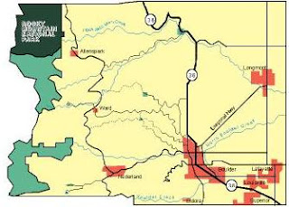
Deep Green: National Park
Light Green: Forest/Park
Red: Cities and Towns
Blue: Rivers/Creeks
Thick Line: Interstate Highway (added for map 2)
Bold Line: Primary Roads
Thin Line: Secondary Roads
Dashed Line: Tertiary Roads
The map I drew for Boulder County, Colorado was fine, save for a few features. In the first map, the size of the font for the creeks are insanely huge, so I made sure to shrink it down to a reasonable, yet still presentable, size. I also added a thick line for the interstate highway passing through the city of boulder, because even with the numbering on, it still could be confused as just another primary road, or vice versa. Other than those, and the placement of the label ‘Longmont’, the map hardly needed revision.
Comparison of Map Types
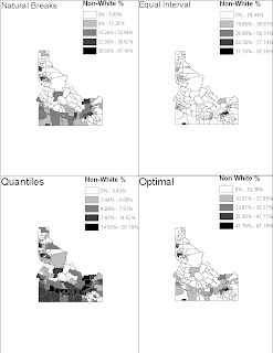
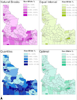
One obvious problem with the first set of maps is that there is far too much in each of those maps. As a solution to this problem, each of the maps are brought to the full extent for the second set, also ensuring greater visibility of the divisions here in Idaho. I also added color to the maps, because although the black-white color scheme is general, it might also be somewhat sensitive, given the subject matter of the percentage of all Idahoans non-white. The data used from those maps are used from the 2000 Census.
No comments:
Post a Comment